
As clinical trial sponsors incorporate more remote technology into clinical trials, researchers must review a wider variety of data sources. As diversity and volume of data increase, so does the complexity around analyzing and interpreting that data. For this reason, clinical data management has become more difficult and time-consuming — while also becoming more important. What’s more, many sponsors don’t have an easy way to view all the necessary data in one place, which leads to errors and inefficiencies.
As payers and regulatory agencies require more data to prove safety, efficacy, and value, manipulating data manually using multiple databases and spreadsheets is no longer the best option. For more informed business decisions, improved organizational efficiency, and increased competitive advantage, instead choose a clinical data visualization tool with an interactive dashboard.
With one login, a data visualization dashboard provides access to all clinical data in one place. Sponsors can view the data they need to make immediate study decisions, while the study team monitors data to mitigate risk and monitor safety and effectiveness.
Building a Data Visualization Dashboard for Clinical Trials
A data visualization dashboard is a tool that allows you to track, analyze, and view KPIs and clinical data points. Using data pooling and automation, a sponsor or their CRO can build an interactive dashboard to visualize clinical study data in real time.
The Preliminary Step: Questions to Ask When Building a Dashboard
Before you start building your visualization dashboard, make sure to gather all the information you need to best serve the intended users. Key questions to ask include:
- What is the primary function of the dashboard?
- Who are the stakeholders?
- What data will they need to view?
- How will we pull the data?
- What tabs should we include?
- What data sources will we need for each of the tabs?
- What visuals do we want to create?
- What filters will we need to drill down the data?
- How often will we need updates?
- Who will need access?
With all necessary information at hand, you’re ready to build. The process involves the following five steps:
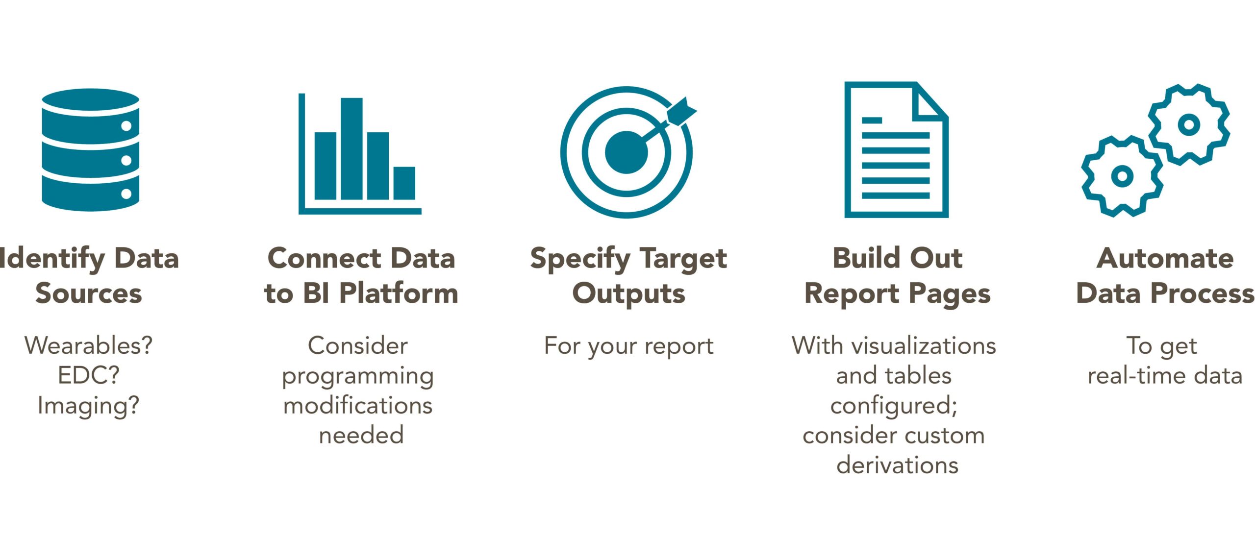
1. Identify the Data Sources
List all your data sources. At Avania, the most common clinical databases we pull from include the electronic data capture (EDC) system, imaging databases, the central lab, study trackers, the clinical trial management system (CTMS), and our site feasibility databases.
2. Connect Data to the Platform
Here, you’ll connect that data to the visualization platform. You might use an API connection or connect data from a local server, a data warehouse, or a cloud platform. Tools like Power BI offer dozens of integrations that allow you to extract from many different sources.
With data connected, it’s time to clean and manipulate that data. We often use SAS, R, or SQL for more complex variable programming as an intermediate step prior to upload in the business intelligence platform. Power BI has cleaning options, as well, albeit less sophisticated than statistical and programming software available.
With clean data, you can add columns, create and change column names, find and replace values, add and delete rows, and otherwise organize your data to suit your goals. Think about your KPIs and the audience when manipulating data.
3. Specify Target Outputs
Now it’s time to customize. Select a visualization — you can create different visualizations for the sponsor, site staff, and business development, for example. Many platforms, including Power BI and Tableau, use a drag-and-drop format to make it easy to choose and rename variables within those visualizations. During this step, you’ll change colors, add data labels, chart titles, and filters, and make other customizations to suit your needs.
4. Build Out Report Pages
With your data imported and your dashboard set up, you’re ready to prepare reports for your study. With Power BI, you can publish drafts and completed reports to the Power BI platform. The platform creates a static link you can provide to stakeholders. As users modify the reports, the link does not change. This means external stakeholders with the link will always have access to the most recent version of that report.
5. Automate the Data Processs
Once you publish a report, you can specify the refresh frequency. Keep your data as real time as possible by setting the tool to refresh multiple times a day. You can also designate a user to receive notifications of any refresh failures. This allows that user to log into the platform and resolve the failure right away.
As clinical trials move toward decentralized models, data management processes require an upgrade. Visualization tools with interactive dashboards fill that need by allowing you to quickly integrate, sort, and analyze clinical data to improve operational efficiency and drive clinical and business success.
Ready to learn more about the power of data visualization? Download our white paper: How to Use Data Visualization to Improve Clinical Trial Efficiency and Drive Business Value.